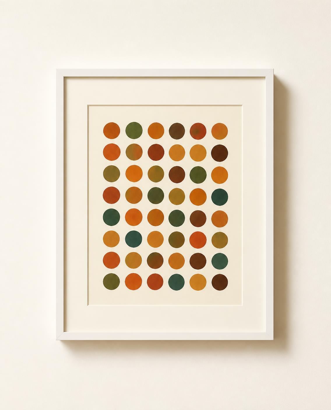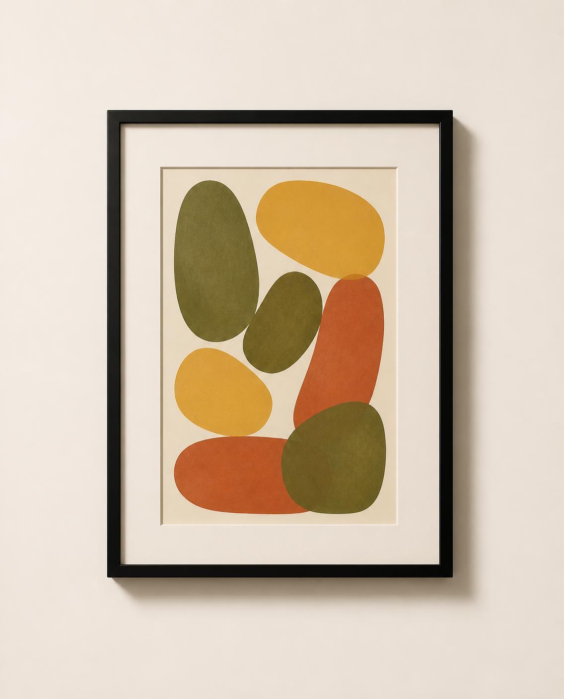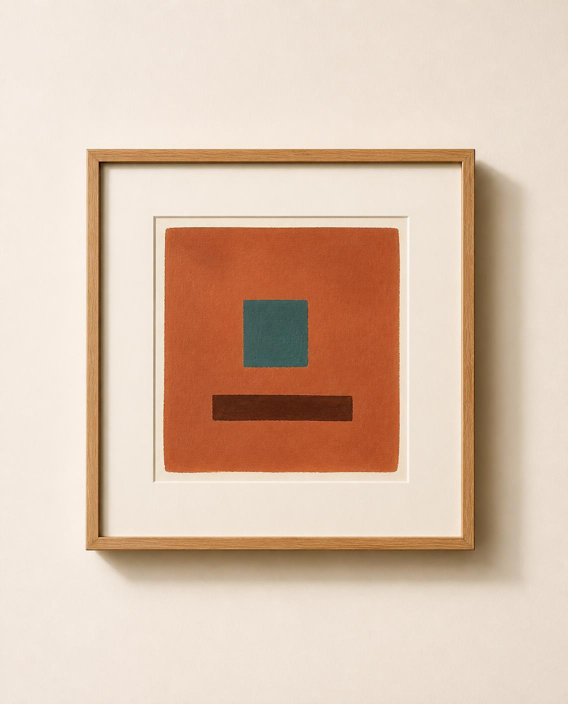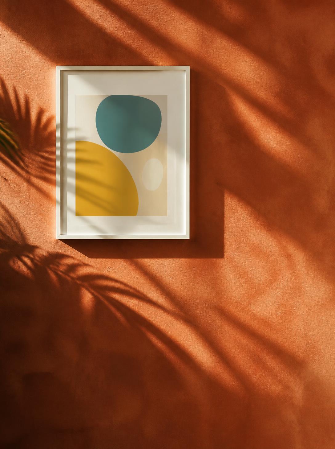
The frame is the bridge between the artwork and your room. The same print can feel warm and relaxed in oak, sharp and graphic in black, or light and airy in white. Here is how we think about each finish.
Natural oak
Oak brings warmth and texture, and it is the easiest finish to live with if your home has wooden furniture or floors. It suits mid-century and Scandinavian rooms especially well. Try it with warm, earthy artwork like Rust Window, where the grain of the wood echoes the tones in the print.
Satin black
Black frames add definition. They work beautifully against pale walls and help bold shapes and photographs stand out. If you are building a gallery wall, one or two black frames give the arrangement structure. Pebble Garden is a good example of how black sharpens soft, organic forms.
Clean white
White frames almost disappear on a white or cream wall, so the artwork seems to float. They are a lovely choice for bedrooms, bright kitchens and small spaces where you want to keep things light. Patterned pieces like Dot Study No. 1 look crisp and modern in white.
Can you mix them?
Yes. A mixed-frame wall feels more personal than a perfectly matched one. Keep the mount colour and the spacing consistent, and let the frames vary. If you are unsure, start with two finishes rather than three.
A quick guide
- Warm wood furniture: oak
- Pale walls and bold art: black
- Small or bright rooms: white
- Gallery wall: any two, repeated